BRANDING AND VISUAL IDENTITY DESIGN
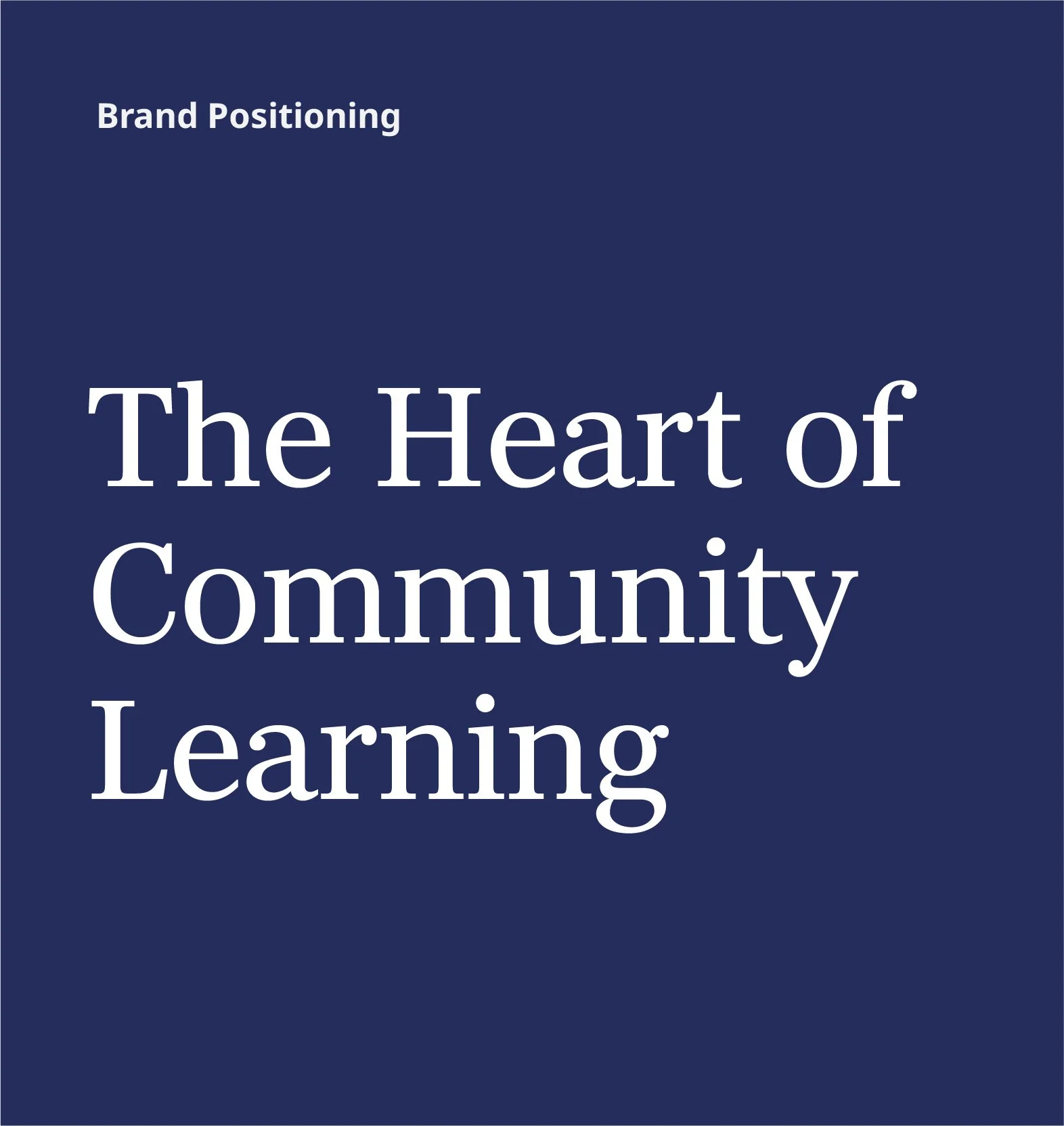
The Heart of Community Learning
Napa Valley Education Foundation seeks to empower Napa Valley youth to broaden horizons, deepen knowledge, and develop the skills to step confidently into their future as healthy, capable, and successful members of our community.
We partnered with the foundation to align their internal and external brand strategy—including positioning, values, and persona—and refreshed their visual identity to bring that strategy to life. Building on the updated system, we redesigned their website, developed a complete stationery suite, and created a range of branded marketing materials.
CLIENT
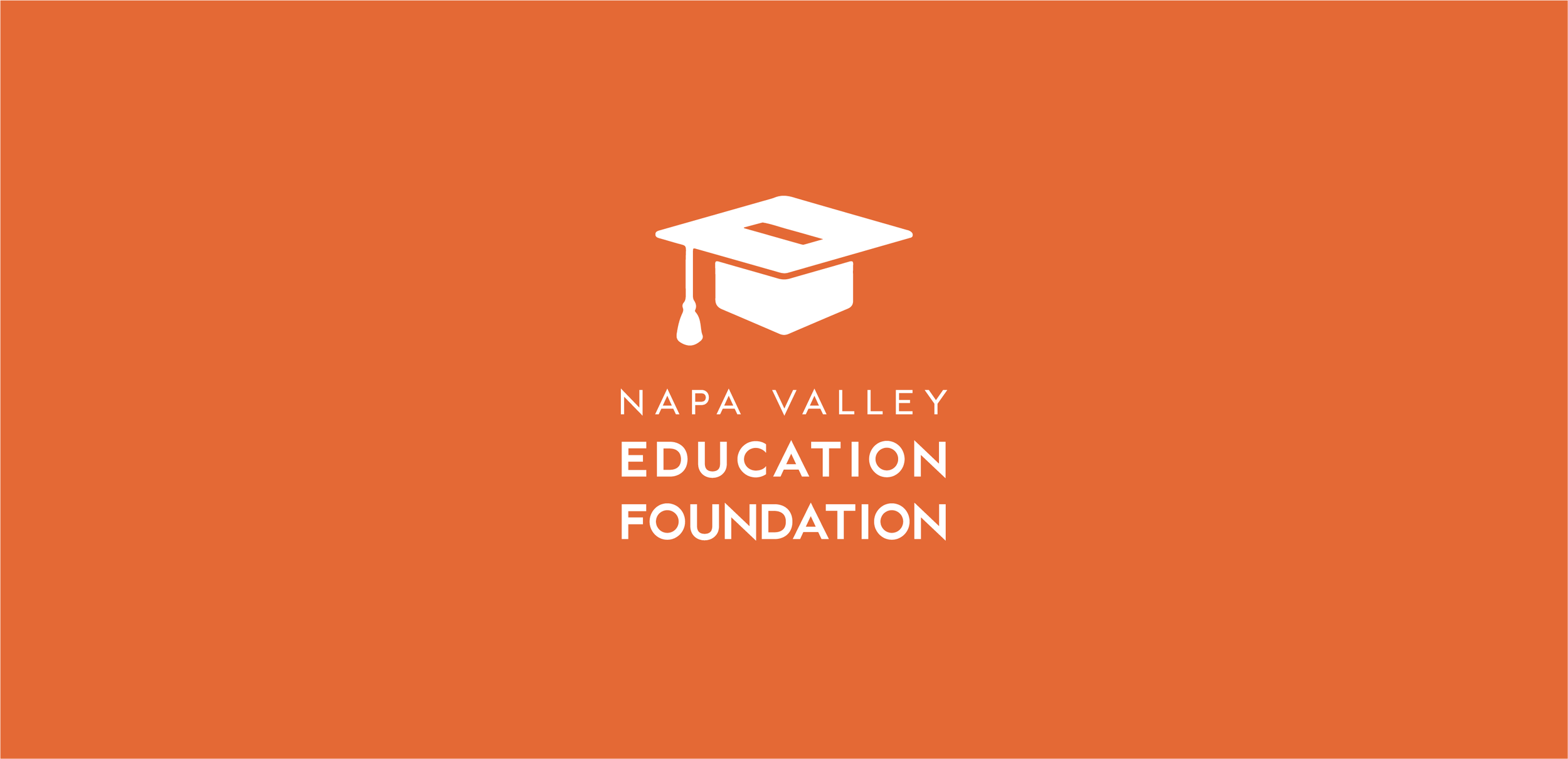
Napa Valley Education Foundation
COLLABORATORS
Stephanie Swain, Brand Strategy
Thomas Wright, Web Development
Aligning the outward brand with the inner organization
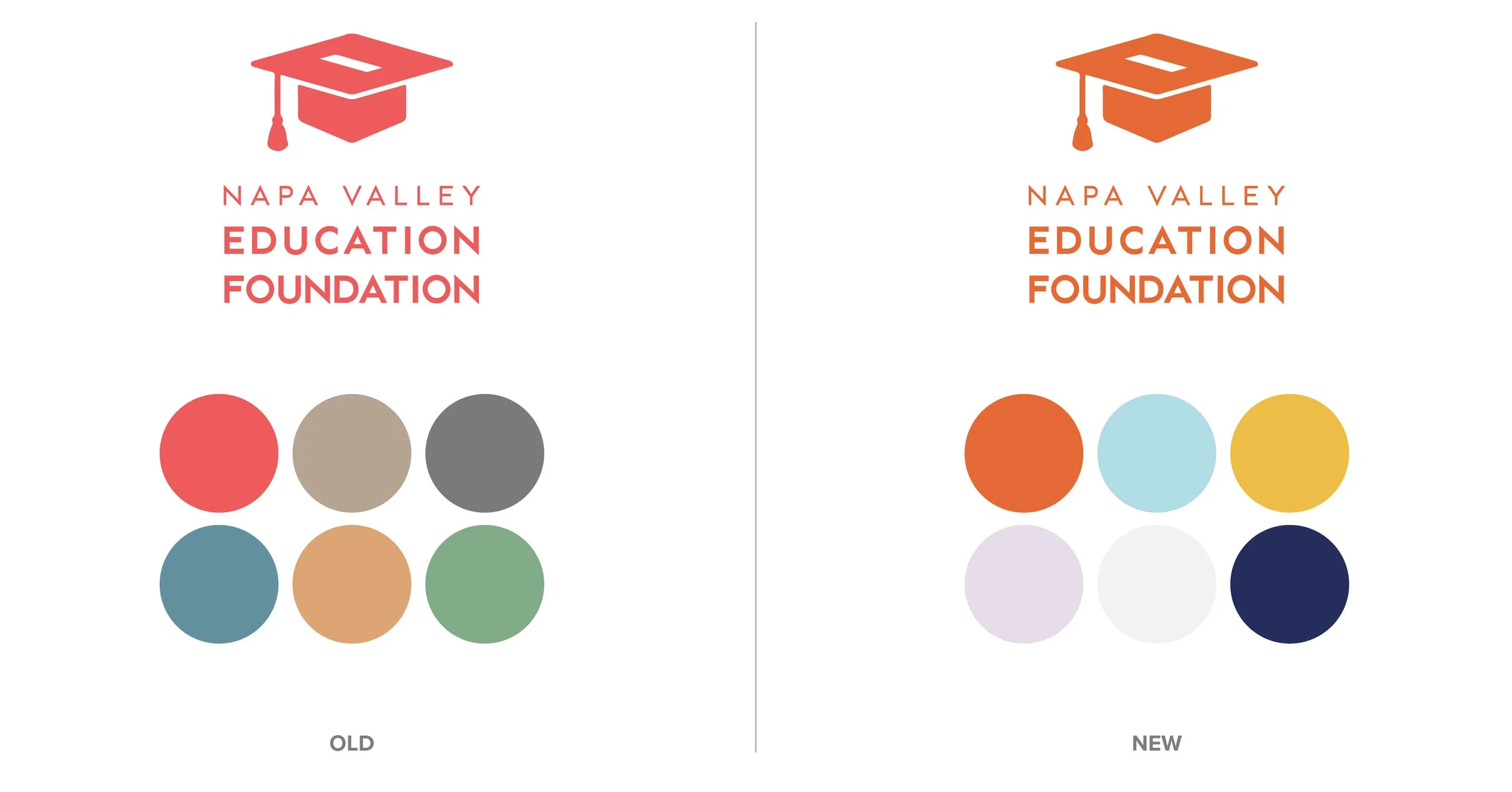
Previously the foundation didn’t have a distilled brand strategy and their visual identity felt heavy and subdued. We collaborated closely with team members, stakeholders, and community partners to understand the foundation’s current perception and future vision. Through interviews, peer research, and industry evaluation, we shaped a brand that feels both authentic and distinctly its own.
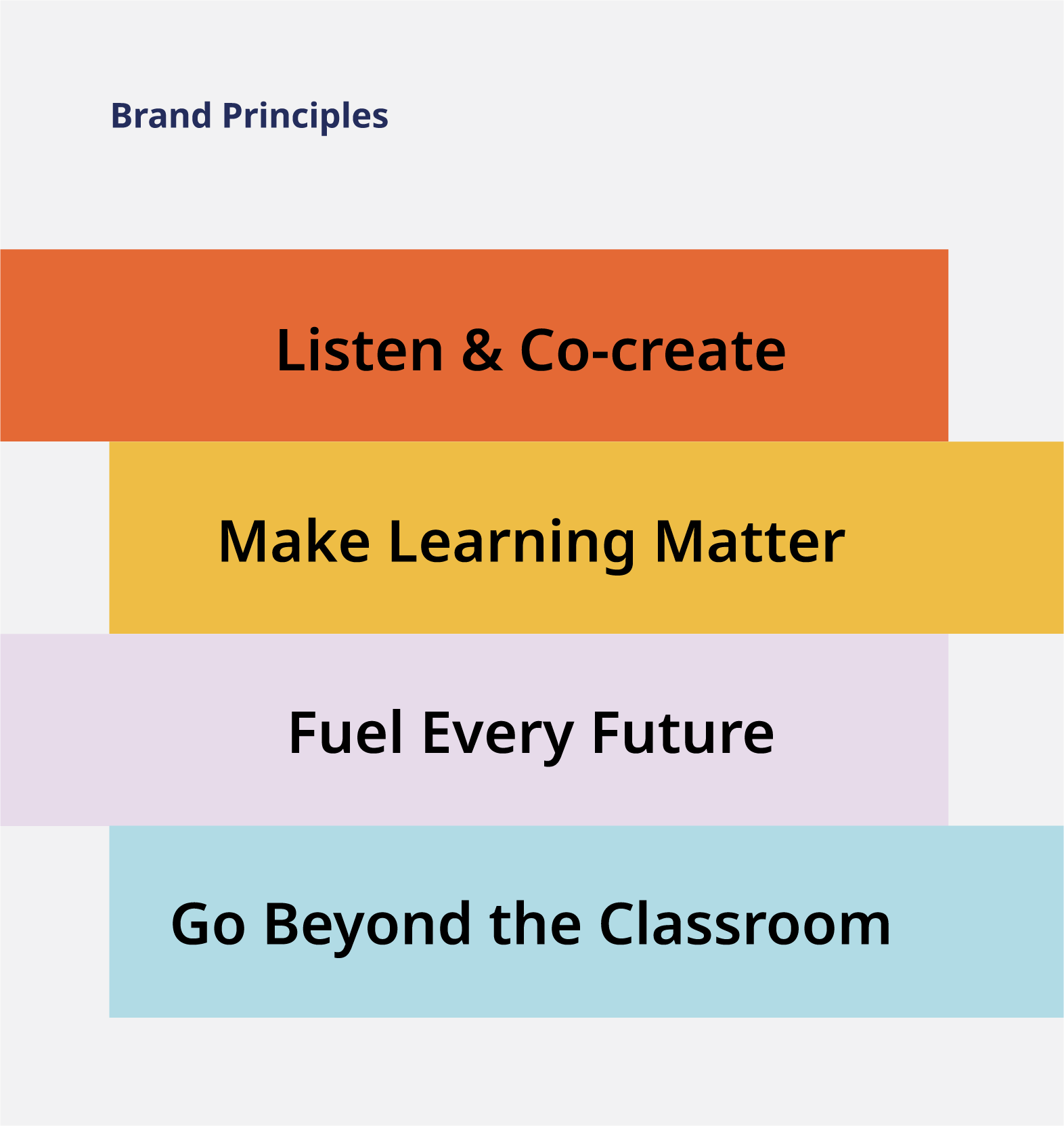
BRAND POSITIONING & PRINCIPLES
The new brand strategy – anchored in the positioning statement “The Heart of Community Learning” – creates internal clarity, aligns people around a shared purpose, and ensures every external effort builds momentum toward the mission.
COLOR PALETTE, TYPOGRAPHY, & GRAPHICS
We crafted a new color palette, typography styles, and graphic elements to bring the brand strategy to life. The result is a visual identity that felt grounded yet vibrant, connected & experienced.
BRANDING
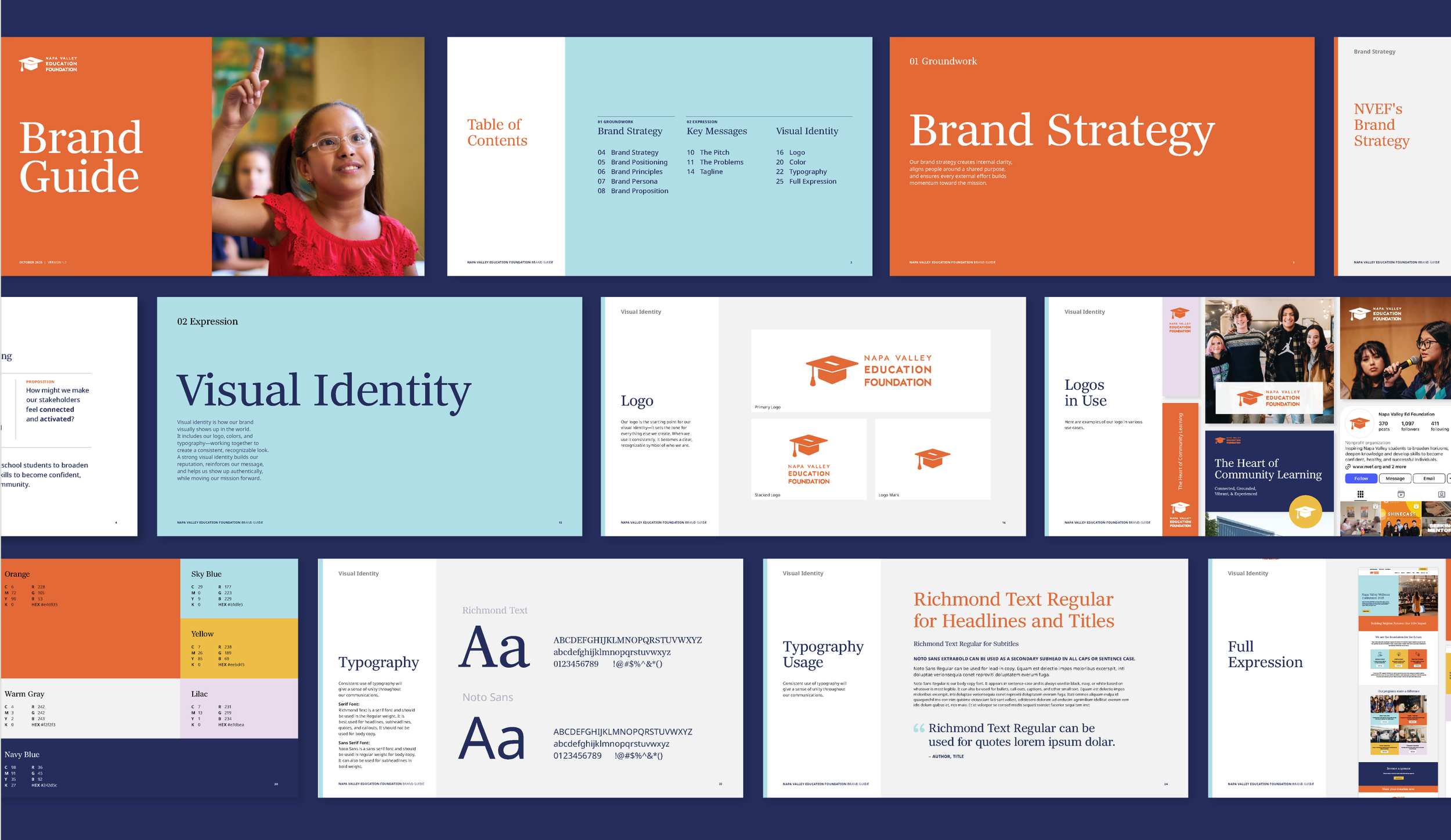
Through this process, we helped align the organization through their brand strategy, messaging, and visual identity as they underwent a major transition and developed a new campus for community learning.

Activating the brand strategy and visual identity
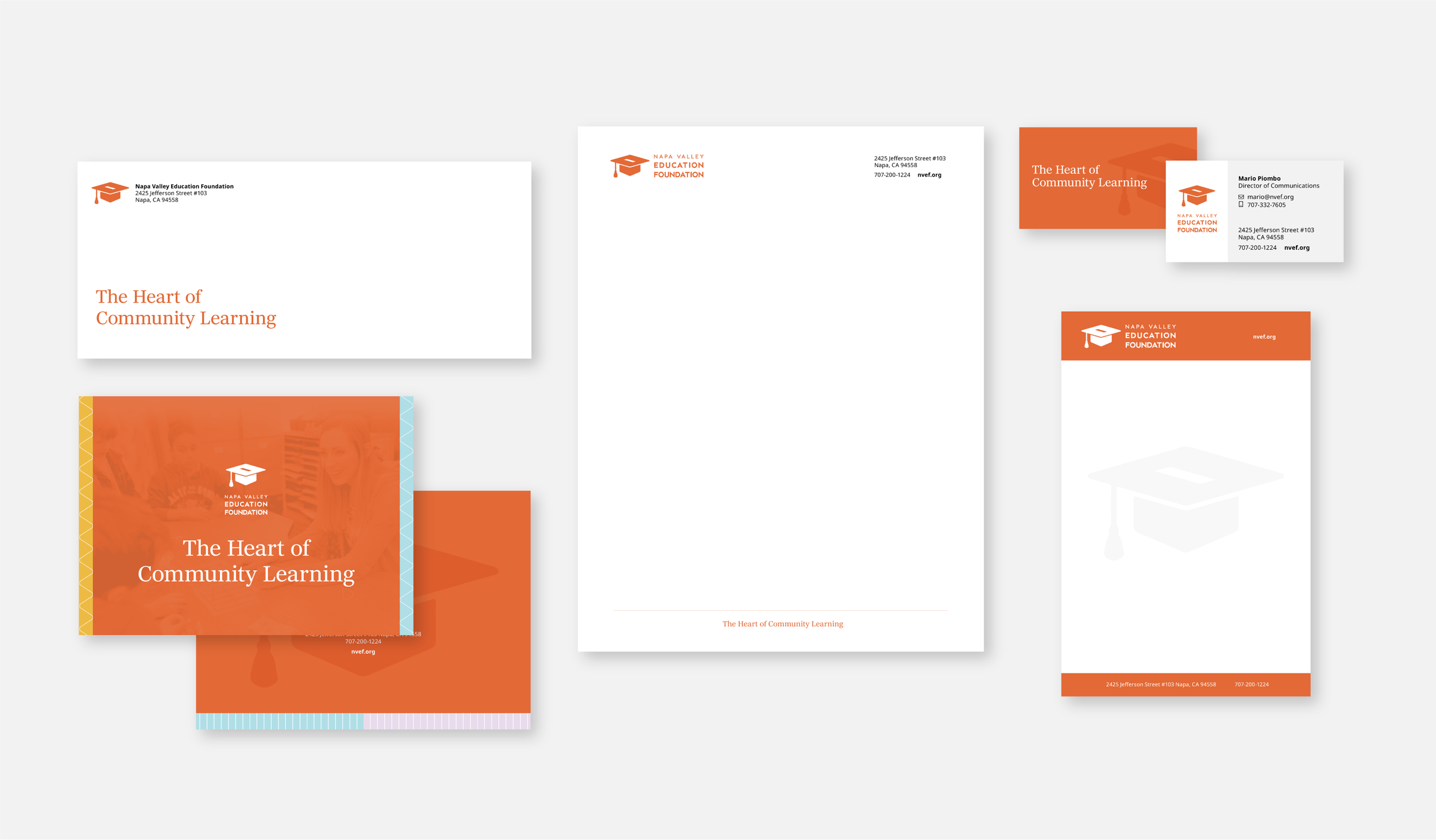
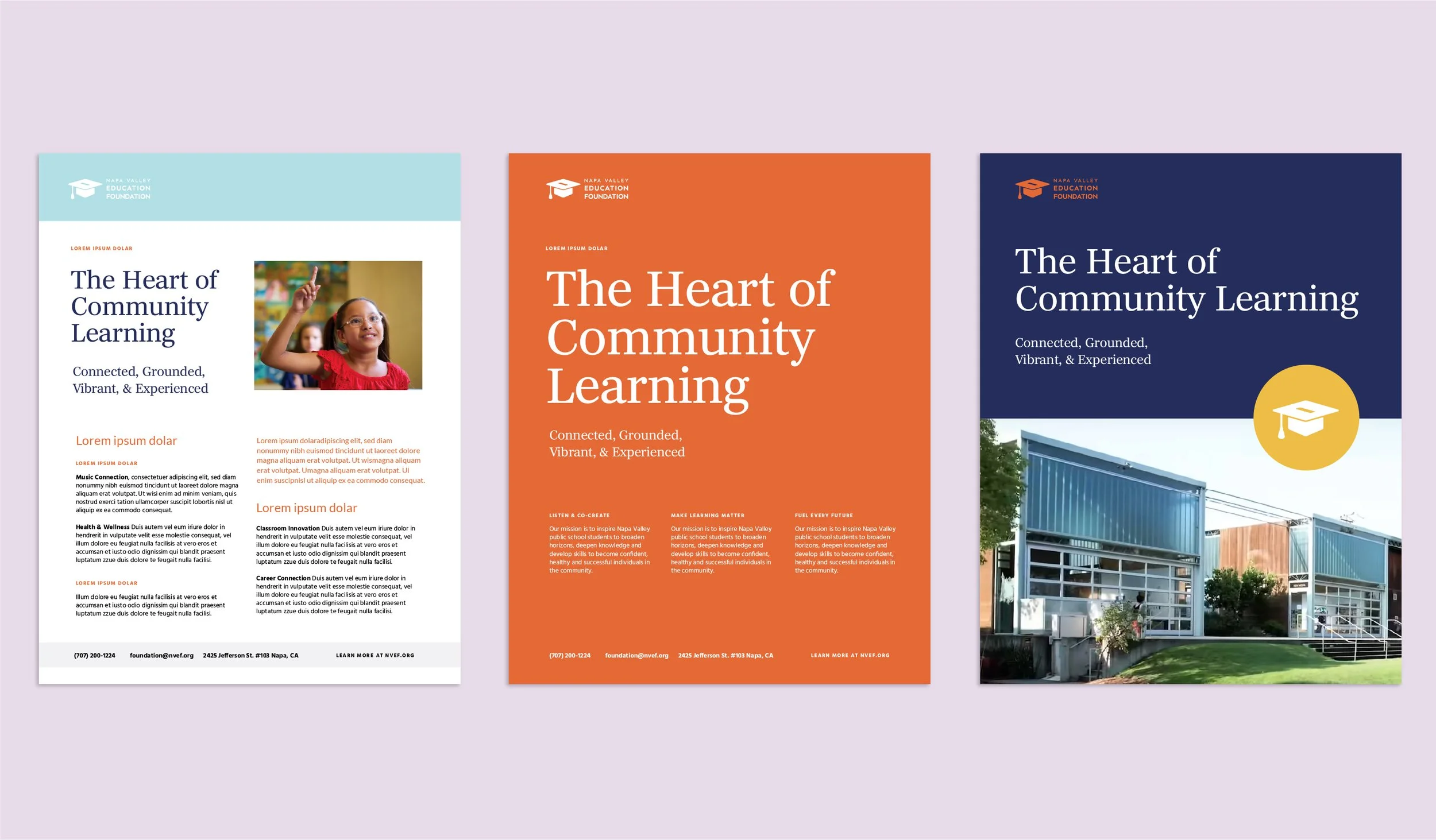
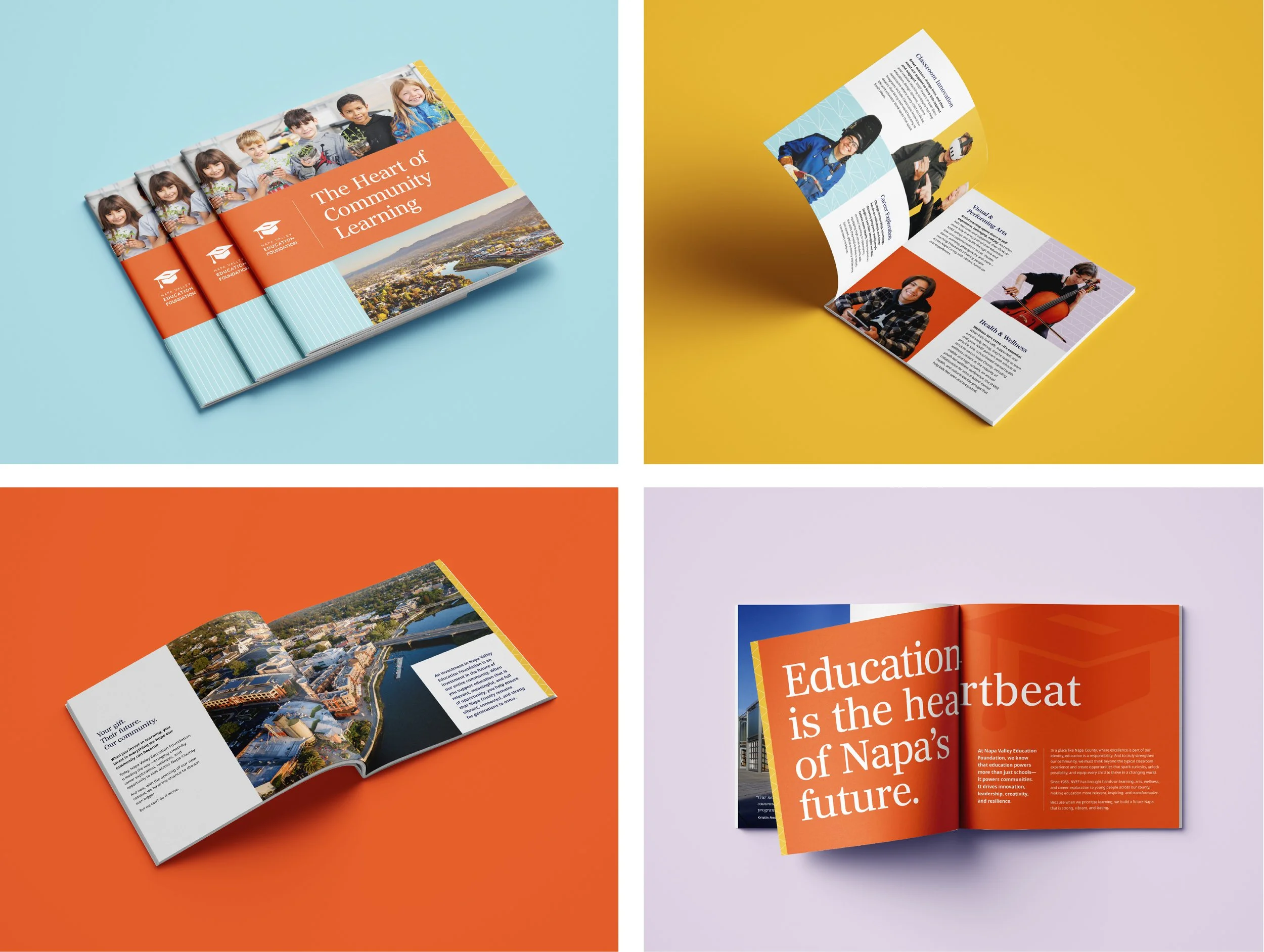
We activated the brand strategy and visual identity across key touchpoints to ensure consistency and clarity. This included designing a cohesive stationery suite, refreshing the website’s color palette and typography, and creating a marketing collateral that brings the brand story to life. Together, these elements reinforce the foundation’s mission and present a unified, confident presence across channels.
STATIONERY, COLLATERAL, & WEBSITE